Introduction
Embarking on a mission for UnDigital, a forward-thinking client discovered through Upwork, I assumed the mantle of a UX/Product Designer. The assignment? To overhaul the "Analytics" page of their digital platform. This case study chronicles a voyage through design challenges, the execution of significant UI modifications, and the creation of a comprehensive 50-screen prototype, all aimed at enriching user interaction and streamlining the experience.
Project Overview
At the heart of this endeavor was a clear objective: to refine the "Analytics" page, targeting specific UI concerns and infusing the space with functional enhancements to elevate usability. The project unfolded across several dimensions:
UI Adjustments: Bridging unexpected layout gaps to ensure uninterrupted visual continuity.
Dynamic Drop Shadow Effect: A design choice that bolstered visual hierarchy, rendering the interface more navigable.
Responsive, Horizontally Scrollable Interface: Tailored for campaign data, this feature kept vital information at the user's fingertips.
Interactive Elements: From hover-enlarged thumbnails to sorting capabilities, these additions were engineered to cultivate an engaging user space.
Attribution Window and Expanding Calendar: These tools provided users with the flexibility to customize data analysis with precision.
Our Team
Brady Starr - Lead UI/UX Designer

Brady’s design acumen played a pivotal role in transforming interfaces across varied projects, always with an eye towards surpassing user expectations.
Destiny Ripp - Project Lead and Design Director

Destiny’s strategic vision and leadership directed the project’s course, blending technical solutions with design execution to bring our collective vision to fruition.
Challenges and Solutions
UI Layout and Scroll Behavior

At the onset of the UnDigital Analytics case study, we were presented with a functional yet nascent analytics interface. The initial dashboard, as depicted in the screenshot provided by Destiny, showcased a straightforward, tabulated data presentation. The core components, marked by Destiny’s notes for enhancement, included a "Lookback Window" feature with predefined day intervals, and a comprehensive campaign list with associated metrics like "Run Dates," "Prints," "Packages," "QR Scans," and various conversion rates and revenue figures.

Key indicators for development were highlighted: the need for a vertically static 'Total for all campaigns' row that anchored the bottom of the data table, ensuring persistent visibility regardless of the scroll position. Additionally, the campaign data columns required a responsive and horizontally scrollable design to manage the breadth of information without overwhelming the user experience.

Destiny’s vision aimed to transform this straightforward layout into a dynamic and intuitive dashboard. The challenge laid forth was not just aesthetic but functional, calling for an interface that could adapt to user interactions and provide a seamless experience in accessing extensive datasets. This foundational interface set the stage for what would become a sophisticated and user-centric analytics platform.

Challenge: 
An unexpected gap appeared between columns due to text size adjustments. Additionally, the need for a horizontal scrollbar that moved with the content was identified.
Solution: 
Adjustments were made to ensure visual consistency and connection between columns. A drop shadow effect was added to delineate "Run Dates," and the "Campaign" and "Run Dates" columns were set as static. A 50-screen prototype was built to simulate the scrolling behavior, ensuring only campaign rows scrolled, with table headers and the total row remaining static.
​​​​​​​
Interactivity and Accessibility
Challenge: 
Enhancing interactivity by removing redundant elements and incorporating meaningful visual cues for campaign status.
Solution: 
Removed the play button to declutter the interface. Introduced a color-coded edge system (green for active campaigns and gray for paused ones) to provide at-a-glance status recognition. Additionally, enabled thumbnail enlargement on hover to facilitate content preview without navigating away from the page.
Sorting Functionality

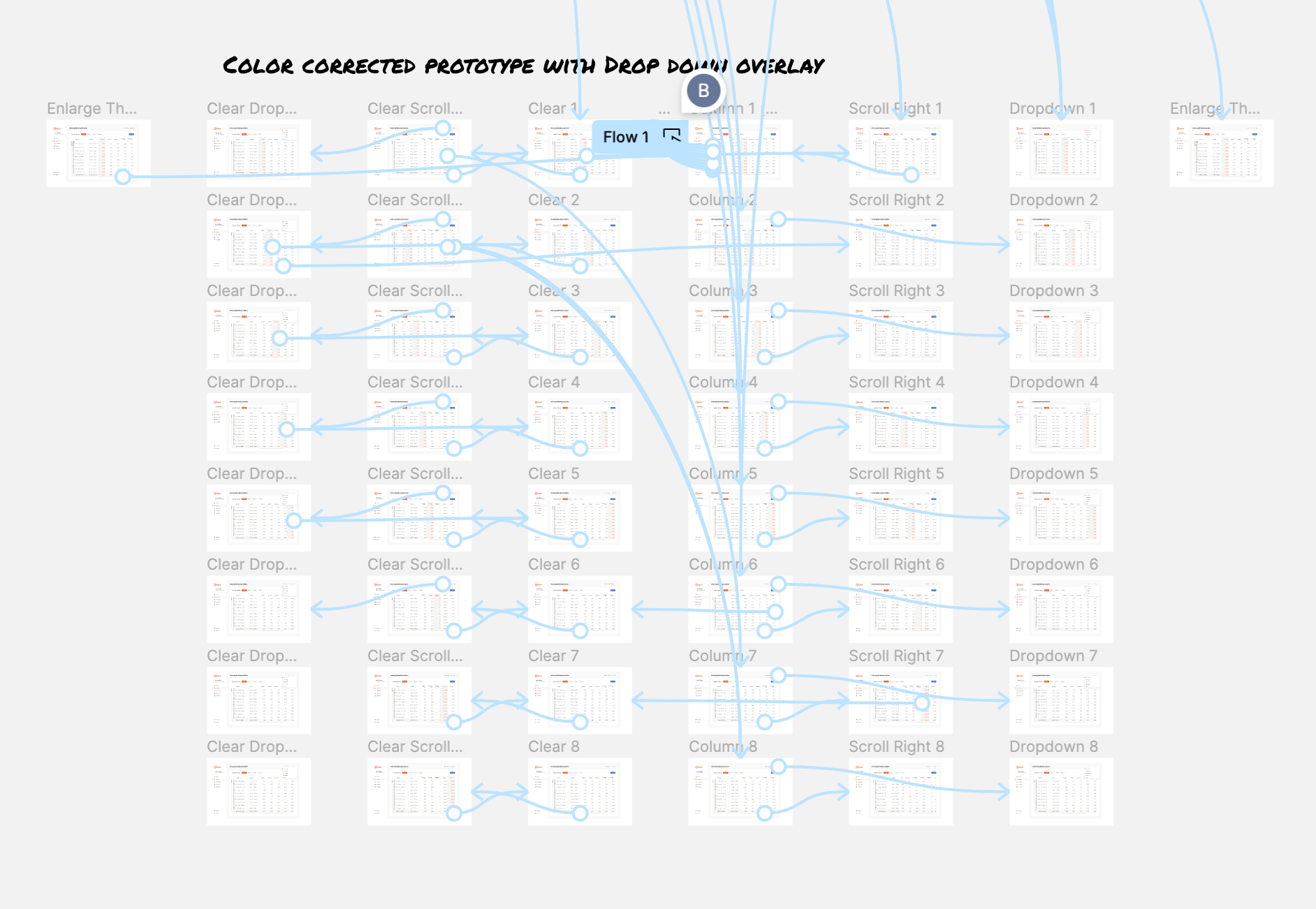
The provided screenshot showcases a complex 50-page UI/UX prototype for an "Analytics" page, featuring a network of interactive elements and pathways indicative of a meticulously crafted user experience design. Each node and connecting line represent a thoughtful consideration of user flow, with overlays and actions suggesting a robust system that prioritizes intuitive navigation and efficient data management. This prototype not only serves as a testament to the designer's attention to detail but also highlights the iterative process behind creating a user-centric interface for UnDigital's analytics platform.

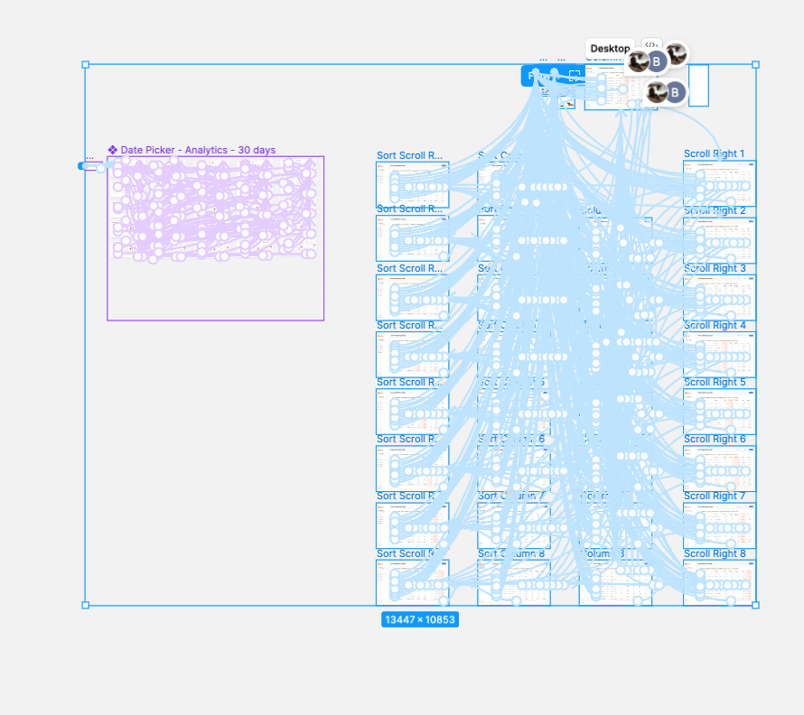
An intricate blueprint of a 50-page UI/UX prototype for UnDigital’s “Analytics” page, displaying an extensive network of interactive elements connected by a web of pathways. Each node and line is strategically placed, demonstrating a complex system designed to enhance user flow and interaction. The sheer density of the connections illustrates a highly detailed approach to ensure intuitive navigation and efficient data presentation. This visual representation serves not only as a testament to meticulous user experience design but also underscores the iterative and thoughtful process that went into crafting a sophisticated, user-focused interface for the analytics platform.

Challenge: 
The sorting functionality was not intuitive, with users unable to sort by clicking on certain elements.
Solution: 
Implemented interactive sorting triggers, allowing users to sort data in both ascending and descending order by clicking anywhere in the header box, including the arrow icon. The "Packages" column was set as the default sorting parameter.
Color Scheme and Design Consistency
Challenge: 
Ensuring consistency with the brand's color scheme and addressing UI elements that were not properly displaying.
Solution: 
Adopted colors from UnDigital's brand library, utilizing the brand green and shades of gray for a cohesive look. Adjusted UI elements, such as dropdown menus, to prevent cutoff and ensure full visibility.
Lookback Window Functionality
Challenge: 
Implementing warning messages for inapplicable lookback window selections.
Solution: 
Designed a pop-up warning message for selections of 6 months or 1 year that do not apply to the user's data. After acknowledgment, a static message remains on the page to remind users of their selection criteria, utilizing placeholder text for demonstration purposes.

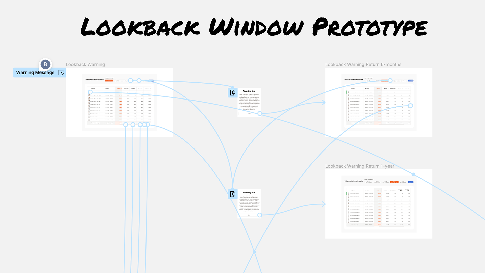
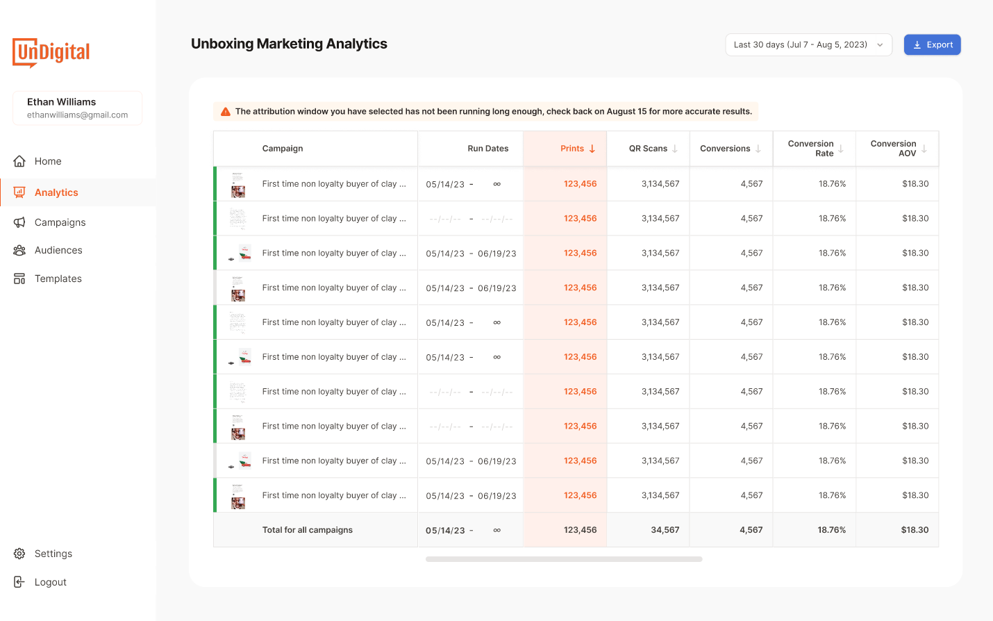
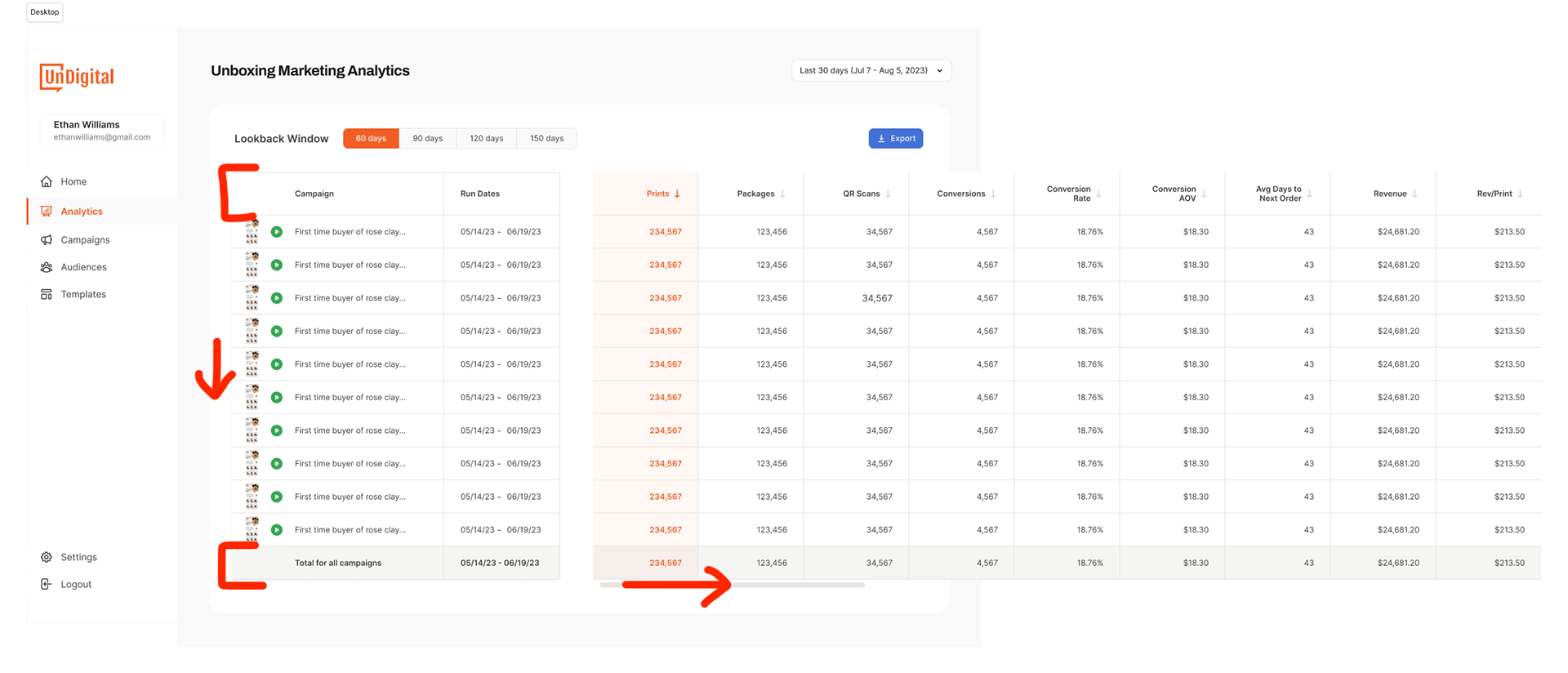
The final rendition of the UnDigital "Unboxing Marketing Analytics" dashboard represents the culmination of an iterative design process, one that was collaborative and detail-oriented. The completed interface, as visualized in this screenshot, is a far cry from its initial iteration. It features a sleek and modern aesthetic with an intuitive layout, significantly enhancing user experience.

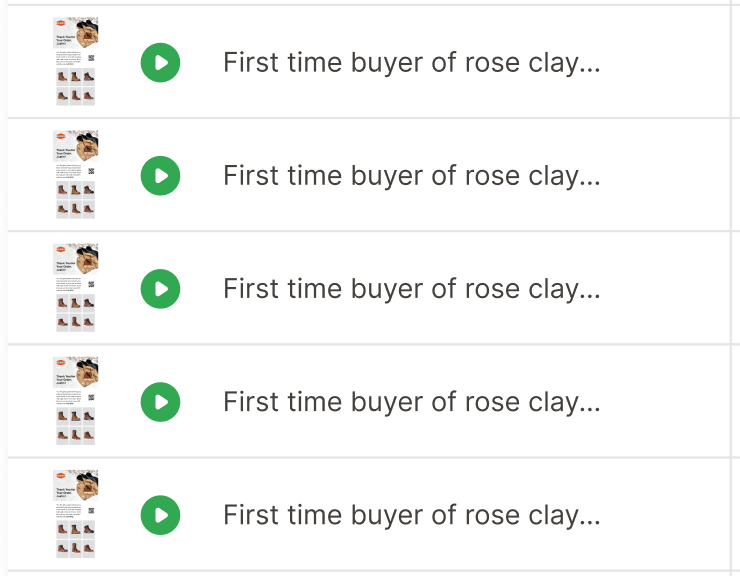
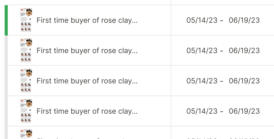
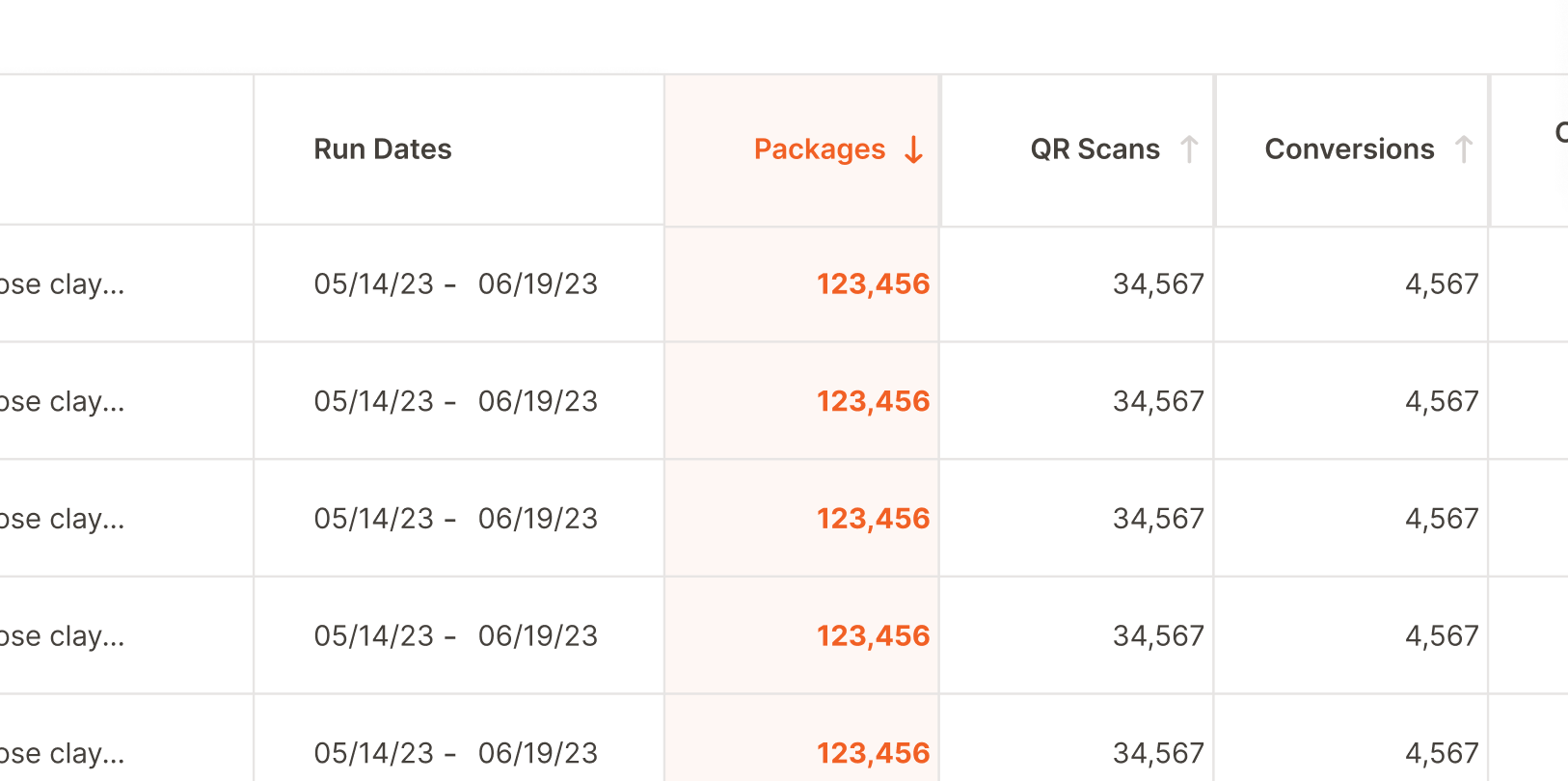
Key improvements are evident: the introduction of a customizable "Lookback Window" and an informative notification banner that guides users on data accuracy based on the selected timeframe. This attention to detail ensures that users are well-informed and can make data-driven decisions effectively. Campaigns are now presented with crisp thumbnails, clear "Run Dates," and organized columns for "Prints," "QR Scans," "Conversions," and related metrics that are essential to marketing analytics.

A particularly innovative addition is the "Total for all campaigns" row at the bottom, which provides a quick summary of collective metrics, ensuring vital data points are always in view. The transformation is not just in functionality but also in form; the dashboard now embodies a sense of structure and clarity, inviting users to interact with their marketing data confidently.

This image serves as a testament to the power of collaboration, user-centric design, and the relentless pursuit of excellence. It marks the project's successful end, turning a functional tool into a sophisticated, user-friendly platform that stands as a benchmark in the field of marketing analytics UI/UX design.

Conclusion
The redesign of UnDigital's "Analytics" page marked the beginning of a transformative journey in the app's user experience and interface design. The success of this project led to the adoption of the newly established design principles as the foundation or template for the rest of the administrative sections within the app. This expansion included critical pages such as "Campaigns," "Audiences," and "Templates," ensuring a cohesive and intuitive user experience across the platform.
In response to the evolving needs of our mobile-first users, I further developed a responsive version of the design. This adaptation was crucial for the mobile prototypes, enabling seamless transitions between different device formats without sacrificing usability or aesthetics. As a result, the project's scope extended beyond the initial "Analytics" page redesign, encompassing a significant portion of the entire product's redesign. This holistic approach not only elevated the user experience across various touch points but also established a new benchmark for the product's design standards.
Through this comprehensive redesign effort, we have not only addressed specific UI concerns and improved data visualization but also set a new standard for the platform's UX/UI design. This case study exemplifies the power of user-centered design in creating effective digital solutions and underscores the importance of adaptability and consistency across an entire digital product ecosystem.

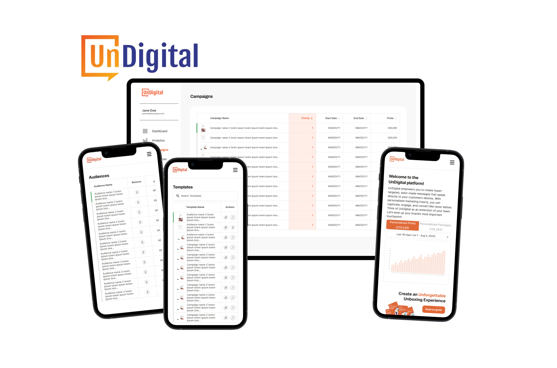
Revolutionizing Administrative Efficiency: The Unified Design Approach across UnDigital's Mobile App Interfaces

You may also like

Back to Top